Colour Contrast in Digital Publications: Meeting WCAG in Flipbooks
WCAG 1.4.3 sets the contrast ratio standards every digital publisher must meet. Learn what the 4.5:1 and 3:1 rules mean for flipbooks, PDF conversion, and how ZenFlip supports WCAG 2.2 AA compliance in digital publications
Written By: Jagadish C U (Founder Of Zentrovia Solutions)
Colour Contrast in Digital Publications:
When a reader opens a digital publication, they should not have to strain to read it. For people who have low vision, colour vision differences, or who read in challenging light conditions, colour contrast in digital publications is not an aesthetic choice - it is a functional requirement. WCAG 1.4.3, one of the most important accessibility standards for digital content, defines exactly what contrast ratio standards publishers must meet to create an inclusive reading experience.
This guide breaks down what WCAG 1.4.3 requires, how it applies to flipbooks and digital readers, and why platforms like ZenFlip build accessibility into the foundation of their reader experience.
What Is WCAG 1.4.3 and Why Does It Matter?
WCAG 1.4.3, officially titled Contrast (Minimum), is a Level AA success criterion under the Web Content Accessibility Guidelines (WCAG), published by the W3C. It sits within Guideline 1.4 (Distinguishable) and has been a core WCAG AA requirement since WCAG 2.0, carried forward unchanged through WCAG 2.1 and the current WCAG 2.2 standard.
The criterion addresses the contrast between text - and images of text - and their background. Its purpose is straightforward: if the contrast between foreground and background is too low, people with low vision, colour blindness, or age-related visual changes may not be able to read the content at all.
In the context of digital publishing accessibility, this matters because flipbooks, embedded PDFs, and online magazines often inherit typography and colour choices from print designs - which are not always optimised for screens. WCAG 1.4.3 gives publishers a measurable, testable standard to work towards.
Read: Your Complete Guide to Accessible Digital Publications in 2026
The Two Contrast Ratio Rules Publishers Must Know
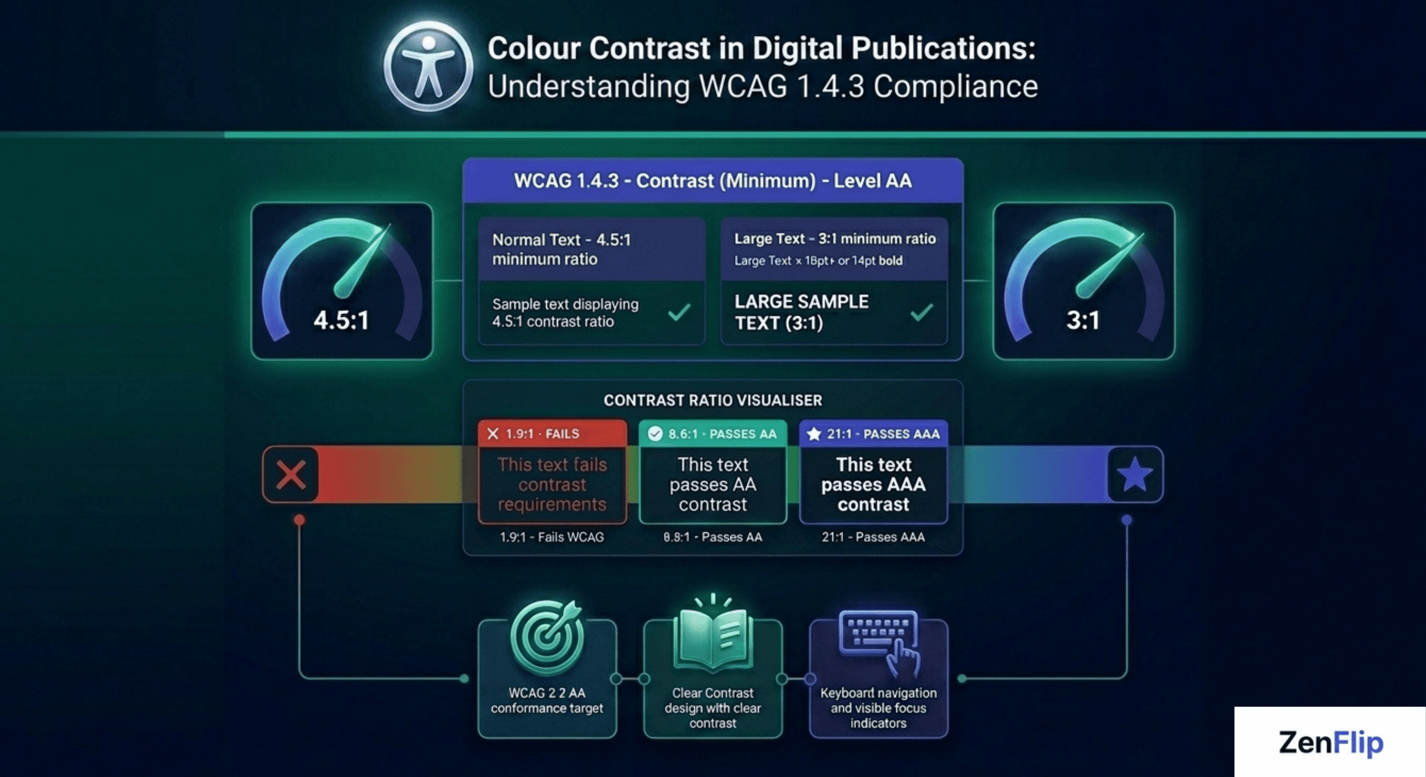
Rule 1 - Normal Text Requires a 4.5:1 Contrast Ratio
For standard body text - any text not classified as large text - the minimum required contrast ratio is 4.5:1 between the text colour and its background. This applies to text, images of text, and interactive labels. A ratio of 4.5:1 means the lighter colour is at least 4.5 times brighter than the darker one, measured using the WCAG relative luminance formula. For reference, black text on a white background achieves a contrast ratio of 21:1 - the maximum possible.
Rule 2 - Large Text Requires a 3:1 Contrast Ratio
Text classified as large is given a threshold of 3:1. Larger text is inherently easier to read even at lower contrast due to its greater visual weight and character size. The 3:1 standard ensures meaningful accessible text contrast while allowing more flexibility in heading and display typography.
Watch: How to Make Your PDF Flipbooks Accessible | ZenFlip Tutorial
What Large Text Actually Means Under WCAG
One of the most common sources of confusion in WCAG 1.4.3 compliance is the definition of large text. WCAG is specific:
18 point (approximately 24 CSS pixels) or larger at normal weight
OR 14 point (approximately 18.67 CSS pixels) or larger when bold
This means a 16px regular-weight heading does not qualify as large text and must still meet the 4.5:1 threshold. Publishers converting print layouts to accessible digital formats - such as accessible PDF to flipbook workflows - often find that their print heading scales do not map cleanly to these thresholds, making a compliance review essential during conversion.
Visit: ZenFlip | Features | Accessibility
Colour Contrast Challenges in Flipbooks and Digital Readers
Flipbooks and interactive digital publications present specific background-to-foreground contrast challenges that static web pages do not. Many flipbooks feature full-bleed background images across two-page spreads. When text is placed over photography or illustrated backgrounds, the contrast between the text and the varying background can shift dramatically across a single page.
Overlay text on images, pull quotes, watermarks, and footer text are common sources of WCAG 1.4.3 failures in digital publications. Accessible text contrast must be checked against every pixel of background visible behind the text - not just a single average background colour.
Visual impairment UX considerations also extend to colour choice within infographics, charts, and data visualisations embedded in flipbooks. Where text labels are used to communicate meaning, they must meet the same contrast standards as body copy. WCAG provides a specific exemption for incidental text in purely decorative imagery, but not for text intended to be read.
Accessible PDF to Flipbook - Contrast Is Not Automatic
A significant share of digital publications begin life as print-ready PDFs before being converted into interactive flipbooks. PDF designs often use colour combinations chosen for print - CMYK ink on paper - which behave differently on screen under the sRGB colour model that WCAG contrast ratios are calculated in.
When converting a PDF to a flipbook, it is important to audit text colours against their digital backgrounds using the WCAG contrast ratio formula. Beige body copy on cream backgrounds, pale grey captions, and reverse-out text on photography are all high-risk areas. Inclusive digital design at the production stage - rather than retrofitting later - is far more efficient. Publishers should treat WCAG AA requirements as part of the design brief, not a post-publication audit.
Choosing the Best Flipbook Software 2026 for Colour Contrast Compliance

When evaluating the best flipbook software 2026, colour contrast compliance should be assessed at two distinct layers: the platform's own reader interface, and the tools the platform provides publishers for managing source content accessibility. A platform can claim WCAG compliance while shipping a reader UI with insufficient contrast on its own toolbar controls - making it important to evaluate both the interface around the content and the infrastructure for the content itself.
ZenFlip targets WCAG 2.2 AA conformance across its entire reader interface, including toolbar controls, navigation elements, visible focus indicators, and interactive labels. This means the platform layer surrounding every published flipbook meets the 4.5:1 and 3:1 contrast standards defined in WCAG Success Criterion 1.4.3 - the accessible UI is not limited to the document content.
Embed Flipbook on Website with Accessible Reader UI
Every ZenFlip publication includes iframe embed code, allowing publishers to embed accessible flipbooks directly on any website or digital platform. When a publication is embedded, ZenFlip's accessible reader UI — including colour-contrast-compliant controls and ARIA-labelled interactive elements - is preserved inside the embedded viewer. Publishers embedding interactive annual report software, digital brochures, or capability documents on investor relations pages and microsites retain the full WCAG-compliant reader experience without any additional configuration.
ImmersiveReader and High-Contrast Reading Modes
ZenFlip's ImmersiveReader mode provides four colour themes alongside OpenDyslexic font, adjustable spacing, and line focus mode. This extends beyond the WCAG 1.4.3 minimum by giving readers the ability to choose the colour combination that works best for their vision and reading needs — including combinations that significantly exceed the 4.5:1 threshold for readers who require higher contrast ratios than the standard minimum. Publishers using ZenFlip as interactive annual report software benefit from this built-in reader flexibility without any additional development work.
Flipbook Analytics for Accessibility Reporting
ZenFlip's Creator plan ($15 per month) includes 30-day analytics, and the Business plan ($39 per month) includes heatmap analytics. These flipbook statistics allow publishers to track which pages and sections generate the most reader engagement, supporting evidence-based content decisions alongside technical compliance work. For publishing teams managing digital publications across multiple properties, access to flipbook analytics transforms colour contrast compliance from a one-time audit into part of an ongoing, data-informed editorial process.
Flipbook No Startup Fee
ZenFlip's free plan supports up to five publications with up to 30 pages each, with no credit card required and no startup fee. Publishers beginning a colour contrast compliance review can publish their first WCAG 2.2 AA-compliant flipbooks on the free plan = accessible reader UI, ImmersiveReader, screen reader support, keyboard navigation, and embed functionality all included at no cost. The Creator plan at $15 per month and Business plan at $39 per month extend publication limits and add analytics as publishing volume grows.
Visit: https://zenflip.io/en
A Practical Contrast Compliance Checklist for Publishers
Check all body text against its background using a reliable contrast ratio checker
Verify headings and display text meet 4.5:1 (or 3:1 if they qualify as large text under WCAG)
Review text placed over images for contrast across the full range of background variation
Audit pull quotes, captions, footnotes, and labels - not just body copy
Check text within infographics and charts embedded in the flipbook
Review at reduced screen brightness to identify borderline cases
Use a tool that applies the WCAG relative luminance formula, not just visual judgment
Building Accessible Colour Contrast Into Every Publication
Colour contrast in digital publications is one of the most testable and directly impactful dimensions of WCAG compliance. Unlike some accessibility requirements that depend on complex screen reader behaviour or ARIA implementation, contrast ratio standards give publishers a clear numeric target: 4.5:1 for normal text, 3:1 for large text.
WCAG 1.4.3 compliance is not only about meeting a technical threshold. It is about ensuring that every reader - regardless of their vision, their device, or the conditions they are reading in - can access the content you have created.
Explore More on ZenFlip

Looking for more insights on digital publishing, accessibility, sports, technology and more? The ZenFlip Library has you covered. Browse our full collection of free interactive magazines.
Every topic. One place. Read free at ZenFlip | Library
FAQs - Colour Contrast in Digital Publications: Meeting WCAG 1.4.3 in Flipbooks.
What is WCAG 1.4.3 and who does it apply to?
WCAG 1.4.3 is a Level AA success criterion under the Web Content Accessibility Guidelines that requires sufficient colour contrast between text and its background. It applies to any organisation publishing digital content, including websites, online magazines, and interactive flipbooks.
What is the minimum contrast ratio required for normal body text?
Normal body text must meet a minimum contrast ratio of 4.5:1 between the text colour and its background under WCAG 1.4.3.
What qualifies as large text under WCAG 1.4.3?
Large text is defined as 18 point or larger at normal weight, or 14 point or larger when bold. Large text only needs to meet a 3:1 contrast ratio rather than 4.5:1.
Does WCAG 1.4.3 apply to text placed over images in a flipbook?
Yes. Text overlaid on images must meet contrast requirements against the background behind it, not just a flat page colour. This makes image-heavy flipbook layouts a common area for contrast failures.
What is the difference between WCAG Level AA and Level AAA for contrast?
Level AA requires a 4.5:1 ratio for normal text and 3:1 for large text under SC 1.4.3. Level AAA raises this to 7:1 for normal text and 4.5:1 for large text under SC 1.4.6.
Does converting a PDF to a flipbook automatically make it WCAG contrast compliant?
No. The conversion process does not alter colours. Print-designed PDFs often use colour combinations optimised for ink on paper, which can fail WCAG contrast standards on screen. A contrast audit of the source file is recommended before publishing.
Are logos and decorative text exempt from WCAG 1.4.3?
Yes. WCAG 1.4.3 includes exemptions for logotypes, purely decorative text, and incidental text in images that carry no meaningful information. All text intended to be read must still comply.
How does ZenFlip support WCAG 1.4.3 compliance?
ZenFlip targets WCAG 2.2 AA conformance, which includes SC 1.4.3 as a core requirement. The reader interface is built with accessible foreground and background contrast, keyboard navigation, visible focus indicators, and ARIA labels throughout.
#WCAGCompliance #ColourContrast #DigitalPublishing #FlipbookAccessibility #AccessibleDesign #WCAG143 #InclusiveDesign #DigitalAccessibility #PublishingAccessibility #WCAG22
Turn your next PDF into a flipbook — free
No credit card, no watermarks, no time limits. 5 publications on the free plan — ready in under 2 minutes.