Accessible Focus Indicators in Digital Readers: Why They Matter for WCAG Compliance
Accessible focus indicators tell keyboard users exactly where they are on a page. Without them, digital readers become unusable for many. Here is what WCAG 2.2 requires and why it matters.
Written By: Jagadish C U (Founder of Zentrovia Solutions)
Focus Indicators in Digital Readers
When someone uses a keyboard to navigate a digital document or publication, they rely on one thing above almost everything else: knowing where they are on the page. That knowledge comes from accessible focus indicators - the visible signals that tell a user which element is currently selected or active. Without them, keyboard navigation in digital readers becomes disorienting, inefficient, and in many cases completely unusable.
For publishers and digital platforms, this is not just a usability concern. It is a compliance requirement under WCAG 2.2 - and getting it right has a direct impact on who can access your content.
Read: Your Complete Guide to Accessible Digital Publications in 2026
What Are Accessible Focus Indicators?
The focus ring explained
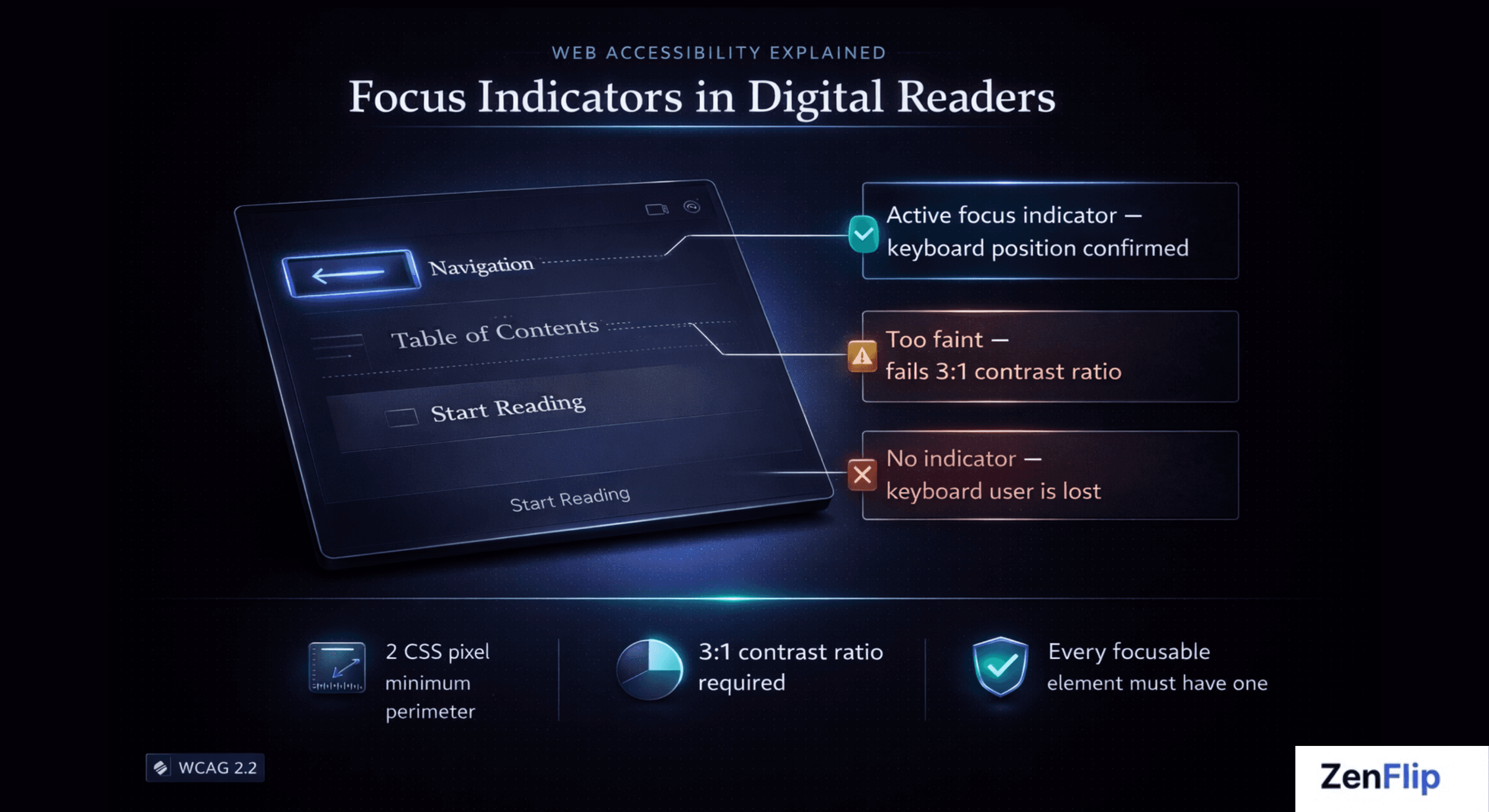
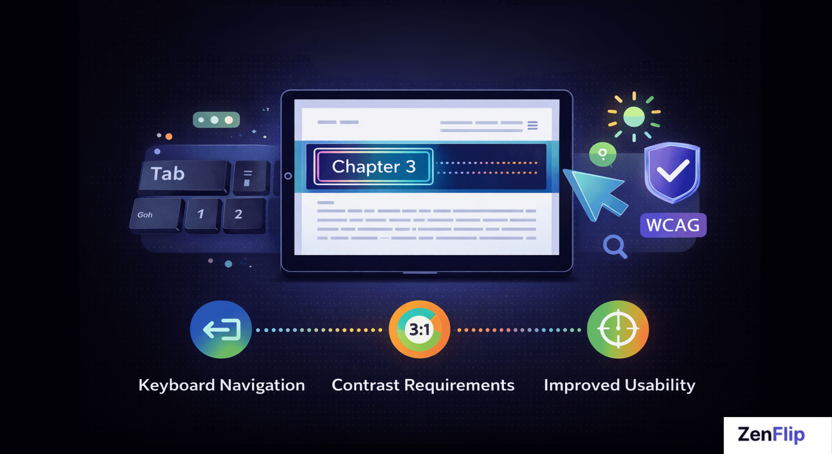
A focus indicator - often called a focus ring - is the visible outline or highlight that appears around an interactive element when it receives keyboard focus. When you press Tab to move through a webpage or digital reader, the focus indicator moves with you, marking your current position.
In digital publishing UX, interactive elements include page navigation controls, table of contents links, embedded media, form fields, call-to-action buttons, and any other element a reader can activate. Each of these needs a clear, visible focus indicator to support keyboard navigation.
The term "accessible focus indicators" specifically refers to focus rings that meet defined standards for visibility - including minimum size, contrast ratio, and persistence. A faint dotted outline that disappears on certain backgrounds does not qualify. An indicator that only appears sometimes does not qualify either.
Visit - Zenflip | Features | Accessibility
Why Focus Indicators Matter for Digital Reader Accessibility
Accessible focus indicators support a wide range of users who depend on keyboard navigation rather than a mouse or trackpad. This includes people with motor disabilities who use keyboards, switch devices, or other assistive technology; people with visual impairments who use screen magnification alongside a keyboard; and users who simply prefer or require keyboard-first navigation.
In the context of digital reader accessibility, a publication that suppresses default browser focus styles - which is a common practice in web and digital publishing design - immediately breaks the experience for these users. Every page turn, every chapter link, every content toggle becomes an obstacle without a reliable, visible focus indicator.
Inclusive design in digital publishing means treating focus indicator design as a first-class concern, not an afterthought applied at the end of a project.
Watch: How to Make Your PDF Flipbooks Accessible | ZenFlip Tutorial
WCAG Compliance Requirements for Focus Indicators
WCAG 2.4.7 and WCAG 2.4.11 explained
Web accessibility standards address focus visibility at two levels in WCAG 2.2, published by the W3C in October 2023.
Success Criterion 2.4.7 - Focus Visible (Level AA) requires that any keyboard-operable interface has a mode in which the keyboard focus indicator is visible. This has been part of WCAG since version 2.0 and remains a baseline requirement for WCAG compliance.
Success Criterion 2.4.11 - Focus Appearance (Level AA) is new in WCAG 2.2. It sets specific minimum requirements for how a focus indicator must look. The indicator must cover an area at least as large as a 2 CSS pixel thick perimeter around the unfocused component, and the contrast ratio between the focused and unfocused states of those pixels must be at least 3:1. This moves the standard from "some indicator must exist" to "the indicator must be meaningfully visible."
WCAG 2.4.12 - Focus Appearance (Level AAA) sets enhanced requirements for even greater visibility, though Level AAA conformance is not required for most regulatory compliance frameworks.
Key point: WCAG 2.4.11 is new to WCAG 2.2 and raises the bar significantly. Platforms that met the old 2.4.7 requirement may not meet 2.4.11 without updates to their focus ring design.
What Good Focus Ring Design Looks Like
Effective focus ring design in digital publishing UX follows a small set of principles that align with WCAG 2.2 requirements and broader inclusive design thinking.
High contrast - the focus ring must be clearly distinguishable from both the element it surrounds and the background behind it, meeting the 3:1 contrast ratio required by WCAG 2.4.11.
Sufficient size - the indicator must be large enough to be seen at normal reading zoom levels. A 1-pixel outline on a high-resolution display is not sufficient.
Consistency - the focus indicator must appear on every focusable element in the reader, not just some of them.
Never suppressed - removing the default browser focus outline with CSS and providing no replacement is one of the most common and damaging accessibility errors in digital publishing.
How ZenFlip Handles Accessible Focus Indicators

ZenFlip, the digital publishing platform built by Zentrovia Solutions, treats accessible focus indicators as a core part of its reader interface rather than an optional accessibility feature. As documented in ZenFlip's accessibility statement, the platform implements visible focus indicators throughout its digital reader, supporting keyboard users navigating page controls, links, and other interactive elements.
ZenFlip also implements keyboard navigation throughout its reader interface, so focus indicator design is built around a complete keyboard interaction model rather than isolated elements. ARIA labels are applied to interactive components to ensure that assistive technology users receive the same navigational context as visual users. Watch: How to Publish Your First Flipbook on ZenFlip | PDF to Flipbook Tutorial
ZenFlip targets WCAG 2.2 AA conformance across its platform. Publishers using ZenFlip benefit from this accessibility layer being applied automatically - without needing specialist knowledge of focus ring design or WCAG success criteria.
For organisations publishing under the UK Public Sector Bodies Accessibility Regulations 2018 or subject to the US ADA Title II requirements effective April 2027, this matters directly. Both frameworks require WCAG 2.2 AA or WCAG 2.1 AA conformance respectively - standards that include the focus visibility requirements described above.
Read: ADA Title II Deadline Extension - Your WCAG Guide to Interactive Accessibility in 2027
Inclusive Design Starts with Focus
Accessible focus indicators are one of the most fundamental features of an accessible digital reading experience, and one of the most frequently overlooked. They cost nothing to implement correctly when considered from the start of a project, and they represent the difference between a publication that is genuinely usable by keyboard and assistive technology users and one that only appears to be.
For digital publishers, the question is not whether to include visible focus indicators - WCAG 2.2 and regulatory frameworks make that requirement clear. The question is whether your publishing platform handles focus indicator design correctly by default, or whether that responsibility falls entirely to you.
ZenFlip is built so that accessible focus indicators, keyboard navigation, and ARIA label support are standard - not optional extras. Explore how ZenFlip approaches digital publishing UX and inclusive design at zenflip.io.
Explore More on ZenFlip

Looking for more insights on digital publishing, accessibility, sports, technology and more? The ZenFlip Library has you covered. Browse our full collection of free interactive magazines.
Every topic. One place. Read free at ZenFlip | Library
Frequently Asked Questions:
What is a focus indicator and why does it matter?
A focus indicator — often called a focus ring — is the visible outline or highlight that appears around an interactive element when it receives keyboard focus. When you press Tab to move through a digital reader, the focus indicator moves with you, marking your current position. Without it, keyboard navigation in digital readers becomes disorienting, inefficient, and in many cases completely unusable.
Who relies on focus indicators in digital publications?
Accessible focus indicators support people with motor disabilities who use keyboards, switch devices, or other assistive technology. They also support people with visual impairments who use screen magnification alongside a keyboard, and users who simply prefer or require keyboard-first navigation. A publication that suppresses default browser focus styles immediately breaks the experience for all of these users.
What does WCAG 2.4.7 require?
SC 2.4.7 — Focus Visible at Level AA requires that any keyboard-operable interface has a mode in which the keyboard focus indicator is visible. It has been part of WCAG since version 2.0 and remains a baseline requirement for WCAG compliance. This is the foundational focus visibility requirement that all keyboard-operable digital publications must meet.
What is new about WCAG 2.4.11?
SC 2.4.11 — Focus Appearance is new in WCAG 2.2 and sets specific minimum requirements for how a focus indicator must look. The indicator must cover an area at least as large as a 2 CSS pixel thick perimeter around the unfocused component, and the contrast ratio between focused and unfocused states must be at least 3:1. This moves the standard from "some indicator must exist" to "the indicator must be meaningfully visible."
Could a platform that met old WCAG requirements fail the new ones?
Yes - platforms that met the old 2.4.7 requirement may not meet 2.4.11 without updates to their focus ring design. WCAG 2.4.11 is new to WCAG 2.2 and raises the bar significantly. Publishers should check whether their platform's focus ring design meets the new contrast ratio and size requirements, not just whether a focus indicator exists.
What does good focus ring design look like?
The focus ring must be clearly distinguishable from both the element it surrounds and the background, meeting the 3:1 contrast ratio required by WCAG 2.4.11, and must be large enough to be seen at normal reading zoom levels. It must appear consistently on every focusable element in the reader — not just some of them. Removing the default browser focus outline with CSS and providing no replacement is one of the most common and damaging accessibility errors in digital publishing.
How does ZenFlip handle focus indicators?
ZenFlip treats accessible focus indicators as a core part of its reader interface rather than an optional accessibility feature. As documented in ZenFlip's accessibility statement, the platform implements visible focus indicators throughout its digital reader, supporting keyboard users navigating page controls, links, and other interactive elements. ARIA labels are applied to interactive components to ensure assistive technology users receive the same navigational context as visual users.
Why are focus indicators so often overlooked?
Accessible focus indicators are one of the most fundamental features of an accessible digital reading experience, and one of the most frequently overlooked. They cost nothing to implement correctly when considered from the start of a project. They represent the difference between a publication that is genuinely usable by keyboard and assistive technology users and one that only appears to be.
Turn your next PDF into a flipbook — free
No credit card, no watermarks, no time limits. 5 publications on the free plan — ready in under 2 minutes.